Archive for the ‘Animation’ Category

Mississippi Mud Pie – Alligator Model Sheet

Well, it’s been a full week since I last updated, so here we go. I’ve been working out the alligator character so that he is animatable and sensible to work with. Surprisingly, there was very little to work out from my original design, just minor simplifications here and there. Specifically, the scutes on his belly and the frills on the back of his head. Instead of the frills going all the way to his tail, he only has four – three on the head and one on the upper back. And the scutes are formed only on the belly and tail – using the sphere form of his stomach to create the upper ones (one at the top, one at the bottom, and two splitting the sphere into thirds), and the cylinder forms for the ones on the tail. The chest area, on the other hand, has no splits in it. After a few attempts, I can get him roughly on model consistently, so that must count for something.

Aligator Model Sheet v3

Still to do: Man model sheet.

Preproduction – The Unbearable Stiffness of Using Maya

The nightmare is over

I’ve decided to do my film in 2D instead of 3D. The reason for this is not because I dislike Maya, or hold any particular grudges against it – it merely isn’t suitable for what I want to achieve. The low poly models I’ve created will go into my portfolio, and I will be still using maya for some background assets and other things. But, for now, at least, the story I am to tell, the movements the characters will make, will be in 2D.

Mississippi Mud Pie – Character Texturing

Today I have been texturing my characters.


Neither are 100% finished, but I think I have made enough progress to post an update. Once these characters are complete, I will work on the environment.

The man is demonstrating the flipped normal polygon shader I researched, which is actually quite elementary. It will form the basis to most of the objects in my film, as I do not have enough polygons to do everything I want with the characters and props. His ear is the most obvious beneficiary of it.

Super Easy Shader Go!

Along with the UV Offset controls and Flipped Normal shaders, I will also be researching other ways to make my film look good while minimising the amount of work the renderer has to do. For example, a fake fresnel shader made with facing ratio hooked to transparency and some kind of colourisation. I’d know how to do it in a game engine, but not Maya, surprisingly!

Progress Update – Posh Man Complete

And unfortunately, 400 polygons over budget – but for a reason. Most of the extraneous mesh is to make deformations more pleasing on the big screen, something I could get away with half the total on a games console.

Update:
Aligator: 100% modelled, 100% UV Mapped, 0% Rigged.
Posh Man: 100% Modelled, 100% UV Mapped, 0% Rigged.

Progress Update: Character Meshes

Now that the animatic has been made, I can start work on the 3D models for the characters.

Since there are two characters within this short, I can spend a lot of time on them. I found out early on that using absolutely authetic methods for creating the characters is unfeasable – in a film you would need a lot cleaner, deformable meshes, so I increased my initial poly count limit from 600 to 800 (not including external “flair” mesh). The current mesh progress is:

Aligator: 100% modelled, 100% UV Mapped, 0% Rigged.
Posh Man: 80% Modelled, 0% UV Mapped, 0% Rigged.

Here are some progress renders:


Mississippi Mud Pie – Rough Animatic

Finally finished the first pass of the animatic, had to go in and actually animate some of the shots to get them to read.

1:51, just under my 2 minute cutoff point. I’m pretty pleased with it.

Mississippi Mud Pie – Movable eyes on a static texture.

One of the challenges I have to face when doing a low poly piece is getting the right amount of subtlety when there isn’t enough geometry to accomodate for it. One of the subtle things I like to do is have nice eye movement in a character, so that they aren’t blankly staring out into space while performing their action – something that is a death knell to PSX characters rendered in high resolutions.

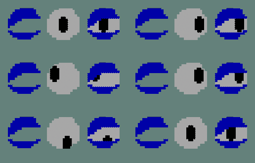
I had to create a method of moving the eyes cheaply and effectively, to keep within the zeitgeist of the era I am mimicking, while lifting the work to a new level of sophistication. To do this, I created a layered shader:

The Pupil – Just the eye, in the middle of a texture. It moves by changing the UV Offset attributes. An Alpha map is created to fill the entire eye area, eyelid included, so that no whitespace is visible where it shouldn’t be.
The Eyelid – This alpha map simply cuts out the eyelid so it can be placed upon the eye.

I created a proof of concept render with some programmer art, and it worked out pretty well. I faked an aim constraint by using a set driven key to drive the UV Offset with the XY translate attribute of a nurbs circle.

Left: Eyelid Texture;Middle: Pupil Texture; Right: Final Texture

Since this is just a test, I plan on several improvements:

– Driving several eye expressions with the same nurbs controller.
– Using image sequences to drive eyelid expression with eyelid alpha and pupil alpha together.
– Changing the size of the eye area, the pupil, and enable complex deformation as to create smear-frame substitutes.

Regarding rendering, using a flat plane is inefficient for viewing the eye from different eyes, so two angled planes would be better, so that from the side, there is the illusion of three dimensionality. Another two faces need to be present for proper deformation.

Mississippi Mud Pie Model Sheets

I’m well into the preproduction for my newest animated short, “Mississippi Mud Pie”. Here are some model sheets for the two characters. Animatic pending!

The Gator

The main character is an alligator. I wanted him to contrast the posh man, so I made him short, squat, and with big, expressive eyes. It was difficult to have a chunky character who also has a high dynamic range of movement. To counteract this, and make him look more like a gator, I opted to make his upper arms thin so that animation wouldn’t be hindered by having to take into account fat deposits there. It also gives a rather nice contrast between body and forearm.

The hardest part of the design, and what required the most redrafting had to have been the legs. I tried to come up with a compromise between my usual “stubby” choice and the more lithe, but more animatable legs I kept drawing for him. The wholly stubby leg design would limit animation and movement.

The Posh Man

The Posh Man is the polar opposite of the aligator. Tall, lithe and composed, with a large cranium and hat (compared to the flattened cranium of the gator). I think the contrast will be fun to animate.

And Knowing is Half the Battle (Conclusion)

This project has been a real learning experience. A trial by fire, but an educational one. What better way to experience just how fragile an animation production is than to experience one burning right around you? An exercise in compromise, subterfuge and meddling, all topped off with mutiny and hidden loathing. What a fantastic way to learn, and that’s no lie.

My leadership skills are, admittedly, very poor. I have never had any luck with identifying faults and organising people.  I think I handled myself quite well, considering, even though there were several casualties along the way. My animation directorial debut was more successful than I imagined it would be.

Well, what have I learnt? I have brushed up on my rigging skills, and am now confident with set driven keys, expressions, and clusters, along with blend shapes and other such things. I have learnt more efficient UV Mapping, how to quickly animate scenes and most importantly, how to not get disheartened when everything goes to pot. I must have had about three nervous breakdowns in the course of this project, but even that has not stopped me from continuing.

Learning hown to quickly adapt to new troubles and incompetencies is one of the most valued skills I could ever learn. By being willing to get down and do any work that needed to be doing, regardless of my role, I feel I have lead a most productive role in this year’s project. Even if the project is unfinished and silent, I really have learnt more invaluable lessons than I would have had it not been the trainwreck it was.

In future, I will not make the following mistakes:

– I will not be too flexible with the animatic. Sometimes the simpler idea is better.

– I will not make a high poly film. 1000 plus a baked on lighting system is enough for me, as I enjoy low poly modelling.

– I will check the credentials of people to see where their strengths and weaknesses (both professional and regarding work ethic) lie.

– I will never, ever try to make something too ambitious on a moldy foundation.

There is nothing more for me to say, other than me and Nunu are still working on the film. It will get done, if it’s the last thing I ever do.

Giving the World some Texture (Texture Mapping)

Long story short, my texture artist got lazy and painted everything lilac. I asked her to texture things properly, but once again I had to swoop in, and rescue the day with my terrible, terrible texturing skills.

Here is a barrel, there are many like it, but this one is mine.Here is my attempt at texturing a barrel. It looks like something from a videogame, says almost everyone.

Here is a signHere is the sign. Originally it was lilac with a texture only where the sign’s picture was. I cleaned up the UV map, textured it with a coffee-stained wood, and changed it to a Phong E, and added a nice little bump map to it, then I added some more mesh to that when it rendered, it would look real sweet.

Then I accidentally lost the file and did it all over again. Hooray!

I am not a texture artist. But, it was pretty fun to do. Wenjie’s mesh was nice to work with when it wasn’t overcomplicated.