Finally finished the first pass of the animatic, had to go in and actually animate some of the shots to get them to read.
1:51, just under my 2 minute cutoff point. I’m pretty pleased with it.
Finally finished the first pass of the animatic, had to go in and actually animate some of the shots to get them to read.
1:51, just under my 2 minute cutoff point. I’m pretty pleased with it.
One of the challenges I have to face when doing a low poly piece is getting the right amount of subtlety when there isn’t enough geometry to accomodate for it. One of the subtle things I like to do is have nice eye movement in a character, so that they aren’t blankly staring out into space while performing their action – something that is a death knell to PSX characters rendered in high resolutions.
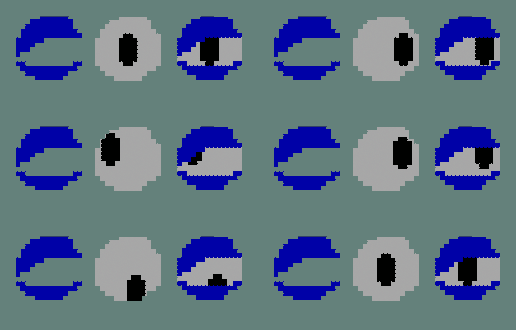
I had to create a method of moving the eyes cheaply and effectively, to keep within the zeitgeist of the era I am mimicking, while lifting the work to a new level of sophistication. To do this, I created a layered shader:
The Pupil – Just the eye, in the middle of a texture. It moves by changing the UV Offset attributes. An Alpha map is created to fill the entire eye area, eyelid included, so that no whitespace is visible where it shouldn’t be.
The Eyelid – This alpha map simply cuts out the eyelid so it can be placed upon the eye.
I created a proof of concept render with some programmer art, and it worked out pretty well. I faked an aim constraint by using a set driven key to drive the UV Offset with the XY translate attribute of a nurbs circle.

Since this is just a test, I plan on several improvements:
– Driving several eye expressions with the same nurbs controller.
– Using image sequences to drive eyelid expression with eyelid alpha and pupil alpha together.
– Changing the size of the eye area, the pupil, and enable complex deformation as to create smear-frame substitutes.
Regarding rendering, using a flat plane is inefficient for viewing the eye from different eyes, so two angled planes would be better, so that from the side, there is the illusion of three dimensionality. Another two faces need to be present for proper deformation.
I’m well into the preproduction for my newest animated short, “Mississippi Mud Pie”. Here are some model sheets for the two characters. Animatic pending!
The main character is an alligator. I wanted him to contrast the posh man, so I made him short, squat, and with big, expressive eyes. It was difficult to have a chunky character who also has a high dynamic range of movement. To counteract this, and make him look more like a gator, I opted to make his upper arms thin so that animation wouldn’t be hindered by having to take into account fat deposits there. It also gives a rather nice contrast between body and forearm.
The hardest part of the design, and what required the most redrafting had to have been the legs. I tried to come up with a compromise between my usual “stubby” choice and the more lithe, but more animatable legs I kept drawing for him. The wholly stubby leg design would limit animation and movement.
The Posh Man is the polar opposite of the aligator. Tall, lithe and composed, with a large cranium and hat (compared to the flattened cranium of the gator). I think the contrast will be fun to animate.